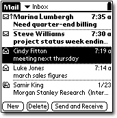
 TMIE's layout on the Treo is very simple and very easy to use. On the main screen, each email has two lines (sender and subject), including a read/unread icon and a time/date stamp. Unread emails appear in bold. It looks very clean, but you can only see five emails/subjects at a time.
 The main screen also has "New," "Delete," and "Send/Receive" buttons, a folder list, and a signal and battery meter.
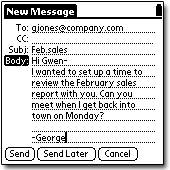
When viewing the full email, you can switch between viewing partial and full headers, which is nice.
Filters
BOING! That is the sound of Handspring dropping the ball. The filters are bad. You can only access/edit them on the web. You can only filter by sender and subject. Even with those filters, your only option is to block sending the email.
You can also turn the service off if your going on vacation. If you don't think you'll be using TMIE for a few days, I highly recommend it. Handspring's servers pull copies of your email from your POP account quite often, so even if you download them all to your desktop, you're still stuck downloading them to your Treo as well. There is no way around this that I can tell.
Customizability >>
Copyright 1999-2016 TreoCentral. All rights reserved :
Terms of Use : Privacy Policy
TREO and TreoCentral are trademarks or registered trademarks of palm, Inc. in the United States and other countries;
the TreoCentral mark and domain name are used under license from palm, Inc.
The views expressed on this website are solely those of the proprietor, or
contributors to the site, and do not necessarily reflect the views of palm, Inc.
Read Merciful by Casey Adolfsson
 TMIE's layout on the Treo is very simple and very easy to use. On the main screen, each email has two lines (sender and subject), including a read/unread icon and a time/date stamp. Unread emails appear in bold. It looks very clean, but you can only see five emails/subjects at a time.
 The main screen also has "New," "Delete," and "Send/Receive" buttons, a folder list, and a signal and battery meter.