|
|
||||||||||||||||||||
|
|
|
|
| Thu Sep 27, 2007 - 12:45 AM EDT - By Andre Kibbe | |
|
|
|
|
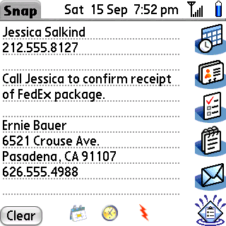
PDAs and smartphones are terrific organizers�almost too good for their own good. If you�re like me, the mental overhead of jotting down someone�s contact information, while trying to sort it into the right fields in a Contact entry can be a slow and self-conscious process, especially in front of the person whose information you�re trying to input. Or maybe the information should be a Memo instead, or a Note attachment to a new Task. That�s a lot to think about before or during jotting down a note. As Palm�s default PIM suite migrated from PDAs to Treos, they lost their dedicated buttons for Tasks and Memos, compounding the problem of fluid data entry. For years, I�ve avoided the problem of deciding where the information should ultimately reside in the Treo by taking down notes on paper first, then inputting these notes into the Treo at my leisure.
Snap is the digital equivalent of my analog workaround. It provides a dedicated Memo-like field as a scratchpad, with dedicated PIM �buttons� at the margins, separating the processes of collecting information and organizing it. Using Snap is a simple, three-step operation:
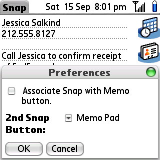
Snap refers to the icons for Calendar, Contacts, Tasks, etc., as �buttons,� which can be confusing, since the program includes an option in its Preferences to �Associate Snap with Memo button.� The latter option refers to the hardware Memo button found on Palm PDAs. SplashData acquired Snap from Hands High software, which called the application �Slap.� Some of the more buried Help screens still make reference to the older name. Snap has more than its share of residue from older POS iterations. Calendar is �DateBook,� Tasks is �To Do List,� Contacts is �Address Book,� and so on. In general, the app still feels like it�s more focused for Graffiti and stylus navigation than QWERTY keyboard and 5-way navigation. It would be nice, for instance, to have some way to highlight text within the memo field without the stylus, but that�s a problem with Palm OS� text selection in general.
The Memo button association is a bigger problem, since there�s no other button to map the application to in the Prefs utility that retains Snap�s �2nd Snap Button� option. This allows a second press of the Memo button to activate another app. Since Treos lack Tasks and Memos buttons, it would have been great to be able to active two different apps with a first and second press of a user-defined button, and the third app on the same button used with the Option key.
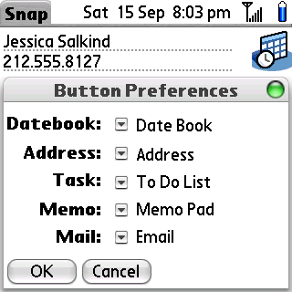
In addition to a Preferences menu, there�s a more useful Button Preferences menu, which allows you to change the apps associated with Snap�s virtual buttons, as long as they use the same databases. You can map the Email button to Chatter or Agendus, but not Blazer.
On Treos, SplashData recommends using the side button or the Option Calendar combination. Since I use the Calendar button for Tasks, and Option Calendar to bring up the Calendar, I initially chose the side button for Snap, but I ultimately reassigned it to the Calendar button. Aside from finding the press-and-hold operation irritating, I had to hit the Power/End button first, then press and hold the side button, since it doesn�t work when the screen is off. The Option key is also ignored when the screen is off, so Option Calendar is equally ineffective as an instant-on selection. My next option, the Email button, worked fine until I HotSynced. Palm�s Prefs apparently requires the button to be an Email app, so my button profile restored Versamail every time I synced. I wound up having to put Tasks on the side button, Snap as the primary mapping on the Calendar button, and associated Calendar to the Option Calendar keybinding. As a potential �front end� for data entry, it�s too bad that most buttons available for activating it on the Treo must be preceded by the Power/End button. It would be nice to start entering information immediately after the press of a single button.
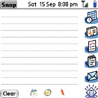
Snap is organized into three basic fields: a text entry �memo� area, a column of the PIM apps into which the text gets imported, and a bottom row, consisting of a Clear button, date stamp picker, a time stamp picker, and an application shortcut tool for launching frequently used apps.
If whatever is in the text field is a single item, there�s no need to highlight it. Just tap the application into which the item is being imported. If you have one or more items in the field, highlight the item to be imported, then tap. The Clear button clears the entire field. If you inadvertently clear the whole field�an easy mistake to make�you can Undo from the Edit menu.
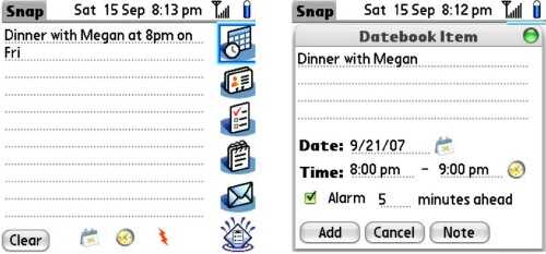
Snap is pretty good at figuring out how to parse a sentence into the proper data fields in Calendar. Writing �Dinner with Megan at 8pm on Fri� will import �Dinner with Megan� into a Calendar entry for the upcoming Friday at 8 p.m., dropping out extraneous propositions and conjunctions. Snap will figure out 8 p.m. written as 8 p.m., 8pm, or 8p. Numeral-only hours default to a.m. entries. Snap recognizes the following formats:

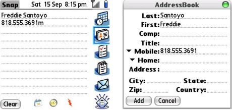
Entering Contacts needs a little more manual formatting from the user. Addresses need to be written in the text field the way they would appear on an envelope: with line breaks. When you select the Contacts icon for importing contact information from the text field, a preview screen shows you how the entry will look before committing it with the Add button. You can swap the First/Last Name, Company Name and Title fields by dragging the lower heading of the fields being swapped into the upper position�a pretty slick feature. Phone numbers default to the Work category, so numbers in other categories must be changed by hand; or you can append one of Snap�s letter codes to the number when you first enter it in the text field. 800.555.1234h gets entered in the Home category. The letters F, P, M, and O designate a number to the Fax, Pager, Mobile and Other categories, respectively.
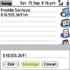
Oh, by the way: you can dial or text message a highlighted number in the text field from the Options menu
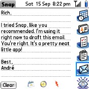
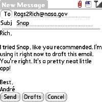
I was surprised by how much I liked using Snap�s text field to compose the body of an email before sending it to the mail app. I have no idea why, but writing an email without initially looking for the recipient�s email address, or navigating to a file attachment, feels more informal and fluid that composing directly inside of a mail client. Actually, that�s true for all apps that take input from Snap, which is really the reason for its existence. I wish it did the same for Messaging, since I text message far more than I email from the Treo.
When sending a selection to the Tasks app, Snap logically interprets each line break (a line separated by a Return) as a separate task, so you can write a To Do list directly into the text field, but they will import into a single category. If you have multiple categories of task lists, you�ll have to import each task separately to assign an individual category to it.
Not surprisingly, sending the contents of the text field into Memo requires the least amount to manipulation�select your category, and you�re done. You can also export to the old Doc format (available under the Options menu), which might be useful if you�re pasting an article beyond Memo�s 4k limit.
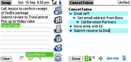
Beyond the vanilla PIM app buttons, there�s a button to send selections to a trial version of one of Snap�s grown-up cousins, SplashNotes. SplashNotes (formerly ThoughtManager under Hands High) is a robust outliner that I found quite addictive for brainstorming and organizing. As a regular user of Progect Manager, an open source equivalent, I appreciated SplashNotes� Zen-of-Palm simplicity, though Progect wins on the sheer number of features (closer to Shadow Plan, but free). I�m registering SplashNotes for its integration with Snap, and its superior desktop client. For a more in-depth look, be sure to read Jay�s TC review.
It�s a relief to be able to enter data without being concerned with how to format it at the same time. This is an app I�ll continue to use beyond the review. I completely love the idea, and almost completely love the execution. Snap could do with an update to optimize its interface for Treos, but the QWERTY and D-Pad functionality work well enough to do the job for now. For the price, it�s an excellent value.
|
|
||||||||||||||||||||
|
Copyright 1999-2016 TreoCentral. All rights reserved :
Terms of Use : Privacy Policy
TREO and TreoCentral are trademarks or registered trademarks of palm, Inc. in the United States and other countries;
the TreoCentral mark and domain name are used under license from palm, Inc.
The views expressed on this website are solely those of the proprietor, or
contributors to the site, and do not necessarily reflect the views of palm, Inc.
Read Merciful by Casey Adolfsson