|
|
||||||||||||||||||||
|
|
|
|
| Thu Oct 4, 2007 - 2:24 AM EDT - By Andre Kibbe | |
|
|
|
|

Where did the day go? Sometimes it�s not enough to just say you worked on something X hours. Sometimes it�s more reassuring, for yourself or others, to have a running log of your activities in black and white. And sometimes it�s more than just reassuring; it�s necessary for accurate compensation, whether you�re billing clients or on an employer�s payroll.
Other times you just need to keep yourself honest. It would be nice if that new exercise regimen you just started maintained itself on enthusiasm and willpower alone, but nothing beats reviewing a time-annotated activity log for renewing discipline when auspicious beginnings start to fade into history.
You could use the Treo�s built-in apps to track things. You could, for instance, create a category in Calendar for back-dating completed tasks. But that would be an inflexible way to see those tasks in a snapshot (except on the desktop in Month View), and it would be useless for generating reports (try faxing the Month View printout to your accounting department). A better approach would be to use Sheet To Go, which would result in a nice spreadsheet when synced to Excel�if you don�t mind making entries on a tiny grid in the first place.
An even better approach would be to use something like TimeTrak, a simple, focused app for logging activities under user-defined projects or categories, complete with the ability to generate reports in Excel.
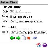
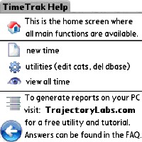
TimeTrak interface is Spartan throughout, like all older generation Palm applications, which is a questionable advantage. Actually, TimeTrack�s older interface was arguably more informative, with captioned buttons that have since been replaced with mostly uncaptioned icons. A gear icon represents �Utilities,� which is TimeTrack�s way of describing the screen for editing Categories and deleting a database. The onboard Help documentation�which is almost all of the Help documentation outside of the PDB Explorer desktop component�consists of a single screen defining the apps icons.
In fairness, TimeTrak isn�t exactly quantum physics. You can get to know your way around the program in one sitting. But some of the terminology and iconography are open to being misconstrued. For instance, the Edit Categories Screen has an uncaptioned icon to create a new category, and the same icon appears lower in the screen with the caption �Delete Entire Database.� The upper one is for deleting a category, the lower one is for deleting all of TimeTrak�s categories and their records. From context, you can pick up that the �X� icon in the upper pane is for deleting categories, due to its grouping, but the fact that the exact same icon is used below, outside of the group, reduces some of the obviousness. It would�ve been clearer to add a �Delete Entire Category� caption to make the distinction more explicit. And it�s literally correct that all of the categories and entries within those categories comprise a single PDB file, but it�s easy for the less savvy user to assume that the �Entire Database� refers to one category rather than all entries in all categories, making it possible to unwittingly wipe out more records than intended.
Kludges aside, setting up time logs is a simple enough process:
Actually stepping through the process highlights a few improvement opportunities Trajectory Labs could address for a more elegant user experience.
TimeTrak has no 5-way support. Not inconsistent or minimal 5-way support. None. It�s one thing to find an old freeware app on PalmGear that only has a couple of fields to navigate between, but an updated POS app in 2007? Not Treo friendly.
The wording of some of the screens and parameters, as mentioned, can be vague. The New Time screen, ironically, doesn�t allow you to enter a time�at least in the sense of selecting start and end times. You can only define intervals: e.g. 3.5, 7, 2. A time tracker should be able to accept clock times, and automatically derive the intervals from the difference.
Notice that in the above array of examples, no units of time are indicated, nor can they be specified. I�m actually pedantic enough to want to be able to make one entry as �20 minutes�, another as �1 hour�, or another as �1 hour and 20 minutes.� The latter record would have to be entered as �1.33.� Another, smaller problem in terminology is the use of �Amnt� to caption the interval field. Since time units are absent from the entries, Amount could be a billing reference to a dollar figure, especially if minutes are the base units rather than hours.
I should point out that most of these nitpicks sound worse than they are in reality. Creating categories, times and reports are quick procedures once you�ve grasped the app�s terminology, and you�ll obviously know what units of time you�re using. But most of the potential features I�ve pointed out seem like simple additions that could result in a much slicker interface.
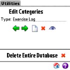
The Category dropdown menu has no �New Category� or �Edit Categories� option. You have to create new categories from the Utilities screen. �Utilities� consists of the two functions mentioned above: Edit Categories�for creating, deleting and modifying categories; and Delete Entire Database�for clearing out all categories and records in TimeTrak. You�ll definitely want to avoid tapping the Delete icon accidentally.
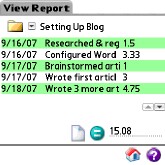
The View Report screen is self-explanatory. Up to five items are listed on a screen at time, which can result in a lot of scrolling once a category spans weeks or months. The screen real estate could be managed more effectively to accommodate at least three more items by eliminating some excessive whitespace and the unnecessary folder icon beside the Category dropdown. There�s an icon to create a New Time (what I�ve been calling a record or an entry) on this screen as well as the home screen. If you add one or more new times, be sure to tap the �=� icon to refresh the report, since the sum isn�t automatically recalculated.
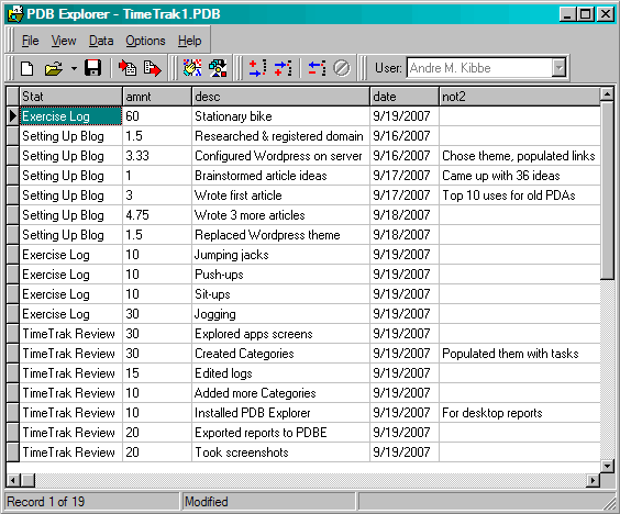
One of the best parts of TimeTrak isn�t part TimeTrak, per se, but Trajectory Labs� generic PDB viewing and exporting application, PDB Explorer. PDB Explorer is used in conjunction with several of Trajectory�s Palm apps for exporting their PDB databases to Excel-friendly CSV files, ripe for editing further, printing or emailing. Not only does this freeware utility work with PDBs from TimeTrak; you can use it with PDBs from any Palm app. I had fun just generating desktop views of data from Palm apps I have that come with no desktop counterparts (yes, I need to get out of the house more if that�s my idea of fun, but then you wouldn�t be reading this).
At $9.95, TimeTrak actually compares favorably with other applications in its category. Many of the time trackers I�ve found for the Palm have similar shortcomings at two or three times the price. In closer price range, the similarly named TimeTrak has a clearer interface, with separate time parameters for hours and minutes, but has buggier Excel report generation�and still costs 50% more. For exporting logs to spreadsheets, TimeTrak is more cost-effective solution.
|
|
||||||||||||||||||||
|
Copyright 1999-2016 TreoCentral. All rights reserved :
Terms of Use : Privacy Policy
TREO and TreoCentral are trademarks or registered trademarks of palm, Inc. in the United States and other countries;
the TreoCentral mark and domain name are used under license from palm, Inc.
The views expressed on this website are solely those of the proprietor, or
contributors to the site, and do not necessarily reflect the views of palm, Inc.
Read Merciful by Casey Adolfsson