|
|
|
| Wed Apr 2, 2008 - 4:12 PM EDT - By Jennifer Chappell | |
|
|
|
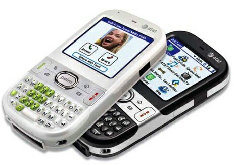
I've been waiting to get my hands on an AT&T Centro, and TreoCentral kindly sent me a Glacier White loaner Centro recently. I know I've mentioned a few times that I'd never want a White device, but I tell ya, that Glacier White Centro actually looks very nice. The silver accents and especially the green number keys just add up to a slick looking device. The White is sort of a pearly white to my eyes. Anyway, when I opened the box I was very pleased.

I had already fondled a White Centro at my local AT&T store recently so I knew that the Centro was a small device. But it's not too small; it's just right. The Centro fits in the hand well and is lightweight and seems to be the perfect size for my hand.
I popped the battery in and charged her up. And what a mighty slim battery the Centro takes. The Centro ships with an 1150mAh battery which holds up pretty well as long as you don't keep your data connection open 24/7 and have your email set to sync too often.
Next I put in my SIM card. I was in a hurry being all excited to get the Centro up and running and didn't read the Getting Started Guide very closely. Here's a tip for putting in your SIM card: Be SURE to remove your stylus from the Centro first! I was staring at that tiny area for the SIM card and thinking, "They've Got to be kidding! How in the crap is this card gonna fit in there?" Well, Duh, just remove the stylus and it slips right in that little SIM card holder. ;-)
I had already bought a SanDisk 2GB micro-SD card for the Centro so I had one ready to put in. My, my, what a tiny card that is! So I got out my tweezers and magnifying glass and proceeded... Nah, it's not That small!LOL! But it is very tiny. I just hope memory cards don't get any smaller than that. You need to remove the battery door in order to access the micro-SD card slot. A little annoying but no big deal.
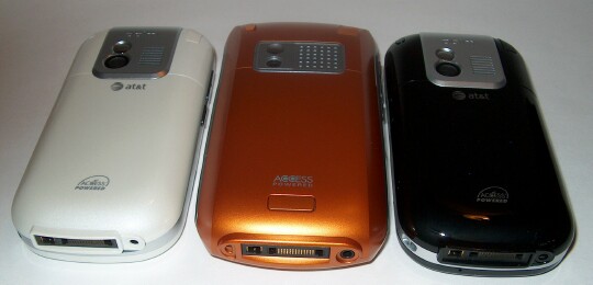
Now what was really annoying to me at first was getting the battery door on and off. I was used to the Treo 680's battery door which has the little button release that you press to get the door off. The Centro battery door doesn't have a release button. Nope, you have to put pressure on the door and slide downward to get the door to slide off. I just don't like squeezing my device like that to get the door off. It makes me nervous. It did get easier the more I took the battery door off and put it back on.
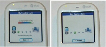
The Centro comes with some nice bonus software and I immediately put those on the device. You get Astraware Solitaire and Astraware Sudoku which are both fun games. You also get Palm Files and Vox. It's pretty neat to be able to download these apps over the air (OTA). Palm put in some cute little graphics with the download as seen in these pics.
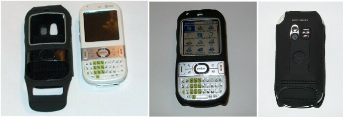
I've been using the White Centro for about a week now and that White color with the cool green number keys has really grown on me. I'm sure that some of you got the White Centro and your 30 days were up before the Black model came out. Check out how the Body Glove Scuba case looks on the White Centro. I fell in love with this case after reading Andre's review. I knew that I'd have to get one of these cases no matter what color of Centro I ended up getting. I'll be sending the White loaner Centro back soon, but the Scuba is going to look pretty darn snazzy on my new Black Centro too!
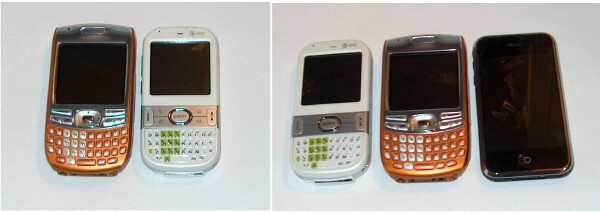
You can get an idea of the size of the Centro from these comparison pics. I still love my Treo 680 and I appreciate the size of both devices. Both feel natural in my hand. I've called people on the Centro and everyone so far has told me that the sound quality is great. It sure sounded great to me too. I love my iPhone too but it doesn't feel as natural in my hand as the two Palm smartphones. Of course the screen and the web browser on the iPhone are no doubt much more superior.

I ordered an Obsidian Black Centro the day before yesterday from Palm's website. UPS delivered it today and I've already charged it up. I haven't set it up yet though. Mmmm, Mmmm, that Black does look goooood! It's much glossier than I thought it would be and it's a bona fide "fingerprint magnet" for sure! But as you probably already know from reading my past articles, I'm obsessive compulsive about wiping fingerprints off of my beloved gadgets, so the glossy finish is no deal breaker for me. I'm sure my cleaning cloth will be making MANY more appearances for this Black Centro though. ;-)

Dieter had some hands on time today with the AT&T Black Centro while in Vegas at CTIA. He sent me some pics to share with you. As you can see, the Sprint Centro isn't as glossy as the AT&T model. The Sprint has the sparkly paint job. What's sort of funny is that even though the AT&T is glossier, there are more fingerprints on the Sprint Centro in these pics. I'm sure it's just that Dieter has handled the Sprint Centro much more. ;-) If you'd like to keep up with the fun goings on at CTIA, be sure to check out the WMExperts site where Dieter is keeping us all up to date. I've seen reports of some drool worthy gadgets so check it out. You can follow WMExperts at CTIA on Twitter and Flickr.
I'm loving the Centro so far! I love the candy bar style and the form factor is wonderful. I don't usually carry a phone in my pocket, but the Centro is such a neat little package that I've caught myself slipping it into my front jeans pocket. I would never have done that with my Treo 650. I loved the 650 but it would have been like having a brick in my pocket. Ugh! The Centro is small enough that it's hardly noticeable.

I've had no problems at all typing on the Centro's keyboard. I can easily type out text messages and emails using the tips of my thumbnails. I love the rubbery, sticky feeling keys. Even though the Centro's keyboard is smaller than the Treo 680's, I like the Centro's keyboard better. The keys on the Centro have a sort of glassy, 3D look to them, whereas the keys on the Treo 680 look flat as the numbers and letters are like painted on.
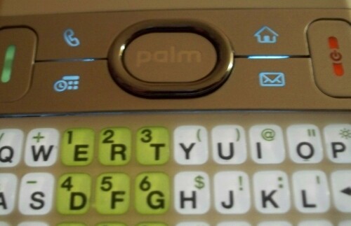
Update:I had meant to mention in this article previously how much I love the blue lit up hard keys, Phone, Applications, Calendar and Messaging. Those small etched in icons with the blue light behind them is really a nice touch. It's a soft blue light and very pleasant looking. And of course I also appreciate the Send button with the green light and the End button with the red light too.
The only problem I've had with either Centro is that on my Black Centro, the ringer switch is much tighter and harder to move back and forth. I can live with that if it's the only problem, and I'm hoping that it gets smoother as I use it more. The ringer switch on the White model moves very easily.
Well, that's my first look. I'm still getting acquainted with the Centro, especially my Black Centro since I just got it today. I'll be doing some accessory and software reviews for both the Glacier White and the Obsidian Black Centro in the very near future.
Copyright 1999-2016 TreoCentral. All rights reserved :
Terms of Use : Privacy Policy
TREO and TreoCentral are trademarks or registered trademarks of palm, Inc. in the United States and other countries;
the TreoCentral mark and domain name are used under license from palm, Inc.
The views expressed on this website are solely those of the proprietor, or
contributors to the site, and do not necessarily reflect the views of palm, Inc.
Read Merciful by Casey Adolfsson