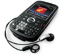
Since Palm announced the Treo Pro on August 20th, many hands-on and full reviews have been popping up on tech sites. Among the first rumblings regarding the Treo Pro, the device was said to possibly be the best Treo that Palm has made yet. With a 320x320 "flush" touchscreen, built-in Wi-Fi, GPS, large 1500mAh battery, microUSB connector, and fast 3G, the Treo Pro is a feature packed device. And it looks pretty darn good on the outside too! The Treo Pro is thin and sexy. Yes, it attracts fingerprints like moths to a street lamp, but fingerprints can be wiped off easily enough.
I've been spotting some Treo Pro unboxing videos and reviews via my Google Alerts, and I'll list the ones I've come across so far. We'll take a brief look at what other websites are saying about the Treo Pro.
TreoCentral/WMExperts

First up, Dieter Bohn wrote an excellent and extensive review of the Treo Pro. Dieter gives the Treo Pro the full run down, so once you've read his review, you'll know the Treo Pro inside and out.
Near the beginning of his review, Dieter says:Here's the short version of this review: I can choose from an embarrassing variety of smartphones, from the BlackBerry Curve to the Centro to the iPhone 3G to various Windows Mobile smartphones. Since I received the Treo Pro, it's what's been in my pocket and even with the devices I see on the horizon in the next few months, it's the device I expect to keep in my pocket for the foreseeable future.
And remember what I said about fingerprints earlier? Well, I loved Dieter's view of the Treo Pro being a fingerprint magnet:
To call the Treo Pro a fingerprint magnet isn't exactly accurate. Magnets aren't a powerful enough metaphor. The Treo Pro attracts fingerprints as a black hole attracts light -- it sucks them inexorably in and you can see them for a time, but eventually they become invisible as they're replaced with newer fingerprints. Which is another way of saying "you get used to it." Mostly. Hopefully we'll see full body skins soon.
Although Dieter likes the flush touchscreen, he isn't too thrilled that Palm excised the traditional Windows Mobile 'soft buttons', which are the two hardware buttons traditionally found at the bottom of the screen that map to the two bottom menus in Windows Mobile.
Instead, Palm has applied the same "you can easily touch the edges of the screen" principle to the soft buttons -- the area is actually quite easy to tap with your thumb and Palm also told me that the touch sensitive area at the bottom actually extends a few millimeters underneath the screen proper as well. For 90% of Windows Mobile apps, it's no problem at all.
There are places where having physical soft buttons are more important, however. The most prominent example is Pocket Internet Explorer in full screen mode -- exiting that without soft buttons requires holding your finger down on the screen to pop up a context menu. It would have been nice to have soft buttons on the Treo Pro, but it's not something I think should prevent anybody from purchasing the device.
Dieter isn't too crazy about the small keyboard on the Treo Pro either. The Treo Pro has a small QWERTY keyboard like the Palm Centro. Overall, Dieter really likes the Treo Pro and actually stated that "the Treo Pro is easily Palm's best Treo yet."
Be sure to read Dieter's full review.
CNET
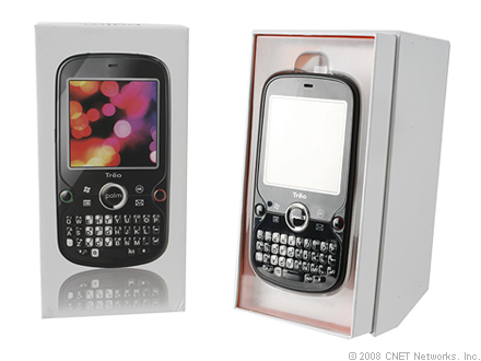
Bonnie Cha over at CNET started out her review mentioning that the Treo Pro wasn't the best-kept secret in the tech world as it had leaked photos and videos all over the Net. Well, we at TreoCentral know all about the many leaks since our forums were a BIG part of the leaks.
Bonnie Cha says that there is plenty to love about the Treo Pro and that it's sexy and is the sleekest touch screen/full QWERTY combination. She also says that the device isn't lacking in the features department either. But even with all that, she says that Palm is simply playing catch up to the competition. Plus she has a problem with Palm only selling the Treo Pro as an unlocked phone for $549, and doesn't see anything to really justify such a high price tag.
Bonnie, along with other reviewers, weren't crazy about the Treo Pro having the small keyboard that is so similar to the Centro.
There's a tad more spacing between the buttons than the Centro, but it's still fairly cramped. I have small hands and had problems using the keyboard, so I would imagine it will give users with larger thumbs some difficulty. We also think that the keyboard doesn't really suit the smartphone. The Palm Treo Pro is designed for business users, and while the cute, gelatinous buttons might be OK for the consumer-centric Centro, it looks a bit unprofessional and childlike on the Treo Pro. We would have preferred the hard buttons from previous Treos.
CNETS Review At a Glance:
- Editors' rating: 7.3 Very good
- The good: The Palm Treo Pro boasts a sleek design and offers a wide range of wireless options, including Wi-Fi, HSDPA, Bluetooth, and GPS. The Windows Mobile smartphone also provides many productivity and communication tools for the business user.
- The bad: The Treo Pro is too expensive and can be sluggish at times. The QWERTY keyboard is cramped and doesn't really suit the business feel of the device.
- The bottom line: The Palm Treo Pro offers significant improvements in the design and features department, but the smartphone doesn't offer anything revolutionary and costs more than its competitors, which will make it a hard sell.
You can read Bonnie's full review here.
Palm Infocenter
Ryan Kairer over at Palm Infocenter says:
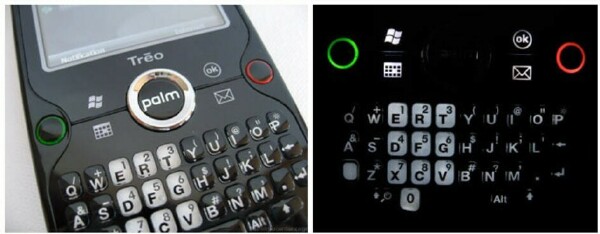
The Treo Pro brings something to Palm's lineup that has been sorely needed in recent times, a dramatically refreshed smartphone that delivers a modern new look with the features to match. It further enhances its profile with a pleasant amount of innovative new features packed into the Palm's most attractive new design in some time.
Ryan talks about the design of the Treo Pro and says that the back of the device is almost as attractive as the front in its own unique way. He notes that the centered camera lens and a large silver Palm logoo are the only standouts on the otherwise smooth and shiney backside of the device.
Although Ryan finds the stylus to be much shorter than usual, he prefers a shorter solid pointer over a flimsy plastic "toothpick styli". And Ryan notes the tendency for the Treo Pro to pick up fingerprints and finds that to be the only negative to the lustrous look.
Ryan mentions the high cost of the Treo Pro but puts a positive note on it:
While its tough to cough up the extra dough for an unlocked device, it's nice that Palm is at least making a new model available to customers first. It's nice not to have to wait through the additional time to market and two year service extensions that usually accompany a carrier purchased smartphone.
You can read Ryan's full review at Palm Infocenter.
Engadget Mobile
Joshua Topolsky over at Engadget Mobile starts out by saying:
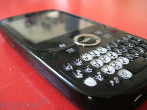
The Treo Pro is the first of what is clearly a new design direction for Palm -- a shiny, black mutation of the popular Centro coupled with a few lines from the Treo 500 and a dash of the original Xbox thrown in for good measure. Under the hood is the staid and familiar Windows Mobile 6.1, with few changes save for the typical Palm shortcuts and the inclusion of an HTC-licensed task manager.
And he asks:
Is this combo powerful enough to lift the smartphone-maker out of the doldrums of its current lineup, or is it just another half-step along the uneven pavement the company has been treading?
Although Ryan feels that the overall design of the Treo Pro seems slightly dated and that the keyboard is uncomfortable and imiprecise, he feels that Palm has scored big time with the flush screen and how thin the device is.
Ryan wasn't very enthralled with the standard 320x320 touchscreen and notes that the cramped workspaces on the Treo line is getting tiresome, and feels that Palm seems to be asleep at the wheel.
Ryan seems pleased with the on-board radios, noting that they had excellent and speedy reception in 3G areas and found the GPS to be very useful even though it took some time to gather satellites and pinpoint Engadget Mobile's location.
In conclusion Ryan says:
All in all there really isn't a lot to say here. The Treo Pro is is a solid, if fairly familiar device that will please the business set and few others. For all its good looks and clean lines, this isn't being marketed to a wide range of customers -- not with its software or its price, and because of that the Pro creates a strange dichotomy. It's the first time in a long time we've seen inspired design from the company, but it's also the first time we've seen them market a device destined solely for the upper tier of buyers (and believe us, up there you've got some pretty stiff competition). Palm, we hate to repeat ourselves, but here's what you should be doing right now: getting your new OS out the door, getting it onto a device that follows in the Pro's design footsteps, and leveraging those hardware costs against a reasonable carrier deal. The Treo Pro is a fine phone, but not the device that will put you back up on top of the pile.
You can read Ryan's full review here.
Brighthand
Antoine Wright over at Brighthand begins by saying that while the model line has gotten away from its Palm OS roots and turned to Windows Mobile, Palm's attention to detail generally sets its Treo smartphones apart from other Windows Mobile offerings.
Regarding the flush screen, Antoine says that it is only the digitizer which is flush and the actual screen is still recessed, making the arrangement disorienting at times.
Regarding the keyboard, Antoine says:
I personally think that the gummy feel of the keys is the worst of any Treo ever; I've had several female friends tell me that they love it better than anything else as they keys work great with their nails. I'll leave it as a toss up to personal opinion there.
Antoine states that the design of the Treo Pro isn't revolutionary but it just works and has an elegance about it.
Antoine noted that calls on the Treo Pro were crisp and clear. He also said that the quality of both speaking and listening matched the best phones he's used. But he went on to say that as a phone, the Treo Pro is not spectacular, and that it lacks a bit of the special touches that he's used to seeing from Palm.
In his conclusion, Antoine says:The Treo Pro is a fairly solid device for Palm. It is easy to delight in the fact that this design has seen yet another revision but has largely kept the trademark ergonomics intact.
The smaller size, addition of Wi-Fi, GPS, increased resolution, and ease of setup are clear upgrades over the Treo 750. These small improvements also makes for a simple transition for enterprise deployments who might be looking to upgrade from 750 units but keep much of the same functionality and ease of use.
You can read Antoine's full review here.
PC Magazine
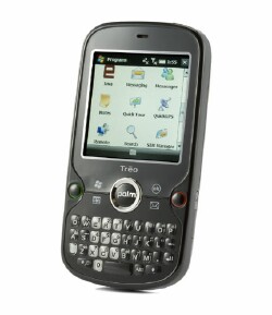
Jamie Lendino says that in testing the Treo Pro, became clear that Palm has learned from many of its prior design and interface mistakes with the 700w/wx and the Treo 750. He notes that the Treo Pro is a slim device, and says that its "surprisingly svelte considering that it packs so many features".
In fact, it weighs 0.7 ounce less than the HP iPAQ 910, one of the Treo Pro's direct competitors and our current Editors' Choice for unlocked smartphones.
With regard to the Qualcomm MSM7201 400-MHz processor, Jamie says that in regular use, the Treo Pro felt a bit sluggish, lagging behind the average BlackBerry or Palm OS Treo. He added that he feels the sluggishness has something to do with the increased screen resolution, noting that typically a 400-MGz CUP is powerful enough for Windows Mobile.
For example, when dialing numbers, I experienced a delay before each key press registered; when I dialed quickly, you could hear audible distortion as the tone sounds piled up. Similar 2-second delays occurred when I switched between applications. On the plus side, I really liked the Task Manager that Palm has placed at the top right-hand corner of the home screen, with bright red "X" buttons that close application threads quickly.
Jamie says that direct competition to the Treo Pro is scarce. He compares the Treo Pro with the iPAQ 910, which has a more comfortable keyboard, a slightly better camera, longer battery life, and costs $50 less. He notes that the 910 has a lower screen resolution, lacks the preloaded TeleNav GPS software, is a bit heavier, and it isn't as stylish as the Treo Pro.
Jamie says that the HP iPAQ 910 retains the Editor's Choice for the moment, but that the Treo Pro's careful, thoughtful software design makes it a close race.
In conclusion, Jamie says:
As with the Palm Centro and the Treo 800w, the Treo Pro alone isn't going to save Palm. But collectively, these devices are evidence of an older, wiser company that's capable of real evolution, even if it lost its core enthusiast base some time ago. Enterprise users would do well to take a good look at this shrewdly updated, professional Treo. It's easily my favorite Palm handset release in the past two years.
You can read Jamie's full review at PC Magazine.
CrunchGear
John Biggs over at CrunchGear says that the Treo Pro is the Treo for you if you're a business professional forced to use Windows Mobile and you travel quite a bit and hardware price is no object.And he adds:
This is also the Treo for you if youre buying a few cellphones for the CEO and the CFO and you want them to be productive without having to change your Windows-based IT and communications infrastructure. If you are neither of those people, think of the Treo Pro as a vision of Palms future.
So, like other reviewers, John feels that the Treo Pro is pretty expensive. ;-)
John feels that the Treo Pro is one of Palm's most attractive Treos to date. And I certainly agree! John mentions that the Centro and Treo 800w took design cues from the lower end of the market, but that Palm had HTC to design this new looking Treo and for good reason. The reason being that RIM was eating Palm's enterprise lunch while the Centro was doing just fine.
Unlike other reviewers, John seems to have no problem using the Treo Pro's smaller Centroesque keyboard. He did mention that the odd center Palm button and the additional OK button made for some odd moments because of confusion as to which button does what.
In conclusion, John says:What are my concerns? That people see the nearly $600 price tag and balk. Nokia can play in the unsubsidized market simply because its been working in that space for quite a long time. When we think of the Treo we think of carrier-specific models - to untether the Pro, even though theyve done the same for the Centro with little fanfare, is distressing. Ive been promised good things from Palm in the next few months but I worry their time has passed. Android could replaces Palm OS as the geek OS of choice and the iPhone and its various knock-offs are whats popular with the kids. This is a step in the right direction. Lets hope the next step comes sooner than later.
You can read John's full review at CrunchGear.
The Mobile Gadgeteer
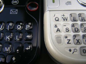
Matthew Miller over at The Mobile Gadgeteer posted an unboxing video and some photos of the Treo Pro on August 22nd. Then more recently, he wrote up a full review of the Treo Pro.
Matthew notes that the Treo Pro is the first GSM Treo with Wi-Fi and GPS and has the latest and greatest specs to make it a winner in the Windows Mobile 6.1 Professional lineup.
Matthew was hoping that the Treo Pro would have the soft-touch rubberized casing since he finds that helps him to grip the device and gives it a more business look. But of course the Treo Pro has the very glossy black covering that is a virtual fingerprint magnet.
Matthew talks about how Palm added a few things to the Treo Pro that makes it a bit more standard across the Windows Mobile platform.
One of the first things I noticed was the indicator light on the top left of the front that shows battery charging status. It is handy to look over and see if the device is charged or not. The earpiece is also centered above the display.
After you turn on the device, you will find that the 320×320 display is presenting you much more information compared to the rather lame 240×240 display found on the Treo 750. I personally considered the Treo 750 a couple of times, but the 240×240 display kept me from taking the plunge. While the 320×320 display is quite nice, I find the 240×320 display on the HP iPAQ 910 Business Messenger to have bolder fonts and richer colors that make it a better display IMHO.
Matthew also mentions the flush display and that he never really noticed the lack of soft key buttons. He feels that flush displays are a new standard for himself on touch screen devices since he loves the way the HTC Touch Diamond and the Treo Pro have used it.
Matthew has a nice section in which he answers questions from readers about the Treo Pro. Head over to The Mobile Gadgeteer and you can read the Q&A section and Matthew's full review.
Gear Diary
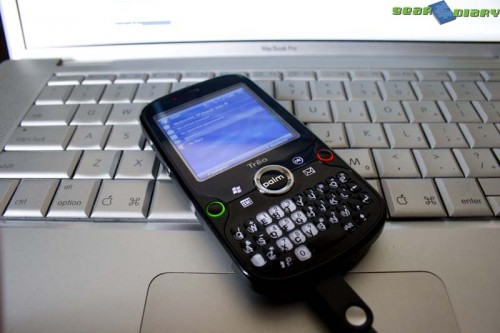
Mitchell Oke starts out by saying that the Treo Pro is a device that could really be a make-or-break product for a company that has been stagnate for quite some time.
Mitchell doesn't seem to be very crazy about the keyboard:
My first thought upon seeing the Treo Pro in the flesh was uh oh, that keyboard doesnt look too good. Its the same keyboard as on the Palm Centro (which Ive never used), and straight off the bat I have a bad feeling about it. The key feel isnt very nice, the travel is very small, they keys themselves are tiny, and they are very close together. The E71 has been my phone for about a month now, and in comparison the Treo Pro is awful. The keyboard on the Treo 750 is considerably better than it. This is a first impressions article though, so Ill leave my final thoughts on that to the review.
Mitchell does seem to be pleased with the Treo Pro's flush, 320x320 display. He likes the rich colors, good brightness and crispness that was lacking from the 240x240 models. And he feels that the screen is very touch sensitive, which is an excellent touch these days with competitors like the iPhone around.
I don't believe Mitchell cares very much for the Treo Pro's camera:
Camera on the back is typical Palm: absolute crap. No auto-focusing, no flash, no resolution. The pathetic two-megapixel shooter is sure to be a disappointment, just like all previous Treos.
Aw, don't be shy Mitchell, tell us what you think. LOL!
Mitchell says that by the looks of it, the 3G radio in the Treo Pro is EXCELLENT. He says that the Touch Diamond was barely able to get a signal in his bedroom but that the Treo Pro hasn't lost the signal once in the few hours that he tested it.
Mitchell will be posting a full review of the Treo Pro in the near future.
Well, that's just a few reviews of the Palm Treo Pro that I've come across so far. I'm sure there will be more to come. I'll update as I see more reviews.