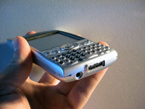
 When Handspring went back to rework the form factor of the Treo 600, they took a dramatically different look at how one might want to use the device. What resulted from all their work is an impressive change from the old Treo design. Gone is the flip; a new Nokia inspired candy bar form is now the design. Also gone is the flimsiness of the original Treo, the Treo 600 is a rock solid piece of electronics. The keys were reworked to; while the original Treos required two hands to operate in most cases, the Treo 600 requires only one.
The GSM Treo 600 has dimensions of 11.2 x 6.0 x 2.2 cm (4.4 x 2.4 x 0.9 inches), and a weight of 168 grams (5.9 ounces). The Sprint Treo 600 is slightly heavier at 175 grams (6.2 ounces), and also has a slight bump in the earpiece. In comparison to the Treo 270 (10.8cm x 7.1cm x 2.1cm, and 153 grams), the Treo 600 is .4 cm taller with antenna, 1.1 cm less wide, and .1 cm thicker. Volume-wise, the Treo 600 is 14 cm3 smaller than previous Treos. One cannot notice the increase in depth, nor does the increase in height affect the usability of the Treo 600 in any way, but the 15% decrease in width has done wonders for the Treo design. Before, the Treo was awkward to hold in one hand, now it fits comfortably. To help make the Treo feel comfortable in your hand, the back of the device is rounded of any edges. It is a very nice touch.
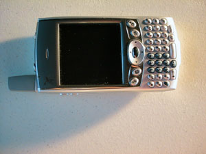 On the front of the Treo 600 is the keyboard, 5 way navigator, 3 application buttons, 1 screen/keylock button, and service/charge LED. On the top of the device is an SD(IO) card slot, a SIM card slot, a power/radio button and a ringer switch. On the left hand side of the device where the jog dial used to be, are two buttons to control volume and ringer sound.
 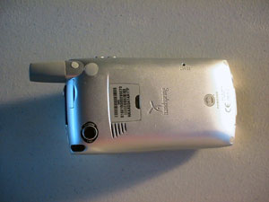 On the bottom of the Treo 600 is the Hotsync port, and a standard 2.5 mm headset port. On the back is a sticker with serial numbers and IMEI numbers, attachment spots for the battery sled, and other future accessories, and on the back left is the camera.
The application buttons are slightly concave making them easy to press. The screen/keylock button does three things. On the default setting from Handspring pressing it once will turn off the screen and lock it, while option-pressing it will only activate the keylock. This behavior can be changed in preferences. 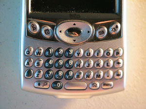 The screen button is a useful addition because it makes turning on the Treo much easier when operating it with one hand. The inclusion of the screen/keylock buttons as one of the application buttons is the Treos first flaw however. While I enjoy the convenience of the button it is hard to sacrifice one of my 4 application buttons for it. I believe that Handspring engineers were on to something, and that the Treo should of included a separate button below the screen to turn on the device like the screen/keylock button, but users should not have to give up an application key to use it.
The LED on the front of the Treo is so small and hard to see it is almost useless. The only thing that it was good for is telling charge status and that is fine. But here is a feature that Handspring could of really capitalized on. The LEDs at top could tell of the presence of new emails, IMs, SMSs, voicemails, the service strength/status, etc. The current LED on both the Treo 600 and first generation Treos can only tell charging and service status; I really wish that Handspring would have improved on the LED to make it more useful.
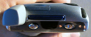 The SDIO card slot is located just to the right of the antenna at the top of the Treo. There are two problems with the slot. The first is that SD cards cant actually go in all the way; there is (depending on the card) a couple of millimeters of it standing out above the Treo. Many users, myself included have found that when the Treo is in your pocket the cards may sometimes pop out. It is a minor annoyance that could have been fixed with a (slightly) deeper slot. The other problem with the SDIO slot is the position of it. Already many SDIO peripherals are not compatible with the Treo 600 because the antenna blocks their ability to fit into the slot. Take Veos new 1.3 megapixel digital camera card, or iBizs pocket radio. Both of these units do not work with the Treo 600 because of their shape. Other problems have cropped up to; Sandisk has stated that the Treo 600 may not be able to provide enough power to the SD slot to power a Wifi card. Either Handspring or the third party manufactures are going to have to change their ways for Treo 600 users to fully benefit from the SDIO slot.
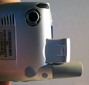 Also at top are the ringer switch and GSM SIM slot. The ringer switch is exactly like the one on the previous Treos, and is an excellent innovative feature to physically turn all sounds off. Handspring had a lot of problems with the SIM door that was in the first generation Treos. There was such an issue of the door breaking that they even reengineered a new door that they currently use on new Treo 300s and Treo 270. In the Treo 600 this issue is gone because SIMs are now inserted into a slot. There is a little sled that you pull out, you pop your SIM card into it, slide the sled back into the Treo 600 and it stays put. The Sprint phone doesnt use a SIM card.
 Replacing the jog dial from the original Treo are two volume buttons. I specifically say volume buttons because that is only what they can do even when in blazer pressing these buttons will control the ringer volume. In my time with the unit I found that they did only two things turn up or down the ringer volume, while on a phone call turn up or down the speaker volume. The latter is a great feature that I have found useful on many handsets, not just the Treo. The former I am slightly confused by. While I see that while in the phone application (not on a call), it would be a good place to make it into a ringer volume switch, when I am on a page that needs to be scrolled, I desperately want to use those buttons. Luckily, several third party freeware and shareware apps have come up to fix this problem.
However, a feature like this should be part of the device, not a third party add-on.
The screen of the Treo 600 is super bright, very crisp, nicely responsive, and is the same resolution of a Palm Pilot from 1996. If there was only one change I could do to the Treo, it would be its screen. Sure one can dial fine, look up contacts, look at ones calendar, check email, and even browse the web on a low resolution screen, but what is possible is not what is best. And I dont say this because the device is hard to use, I say it because it is much easier to read text off of a higher resolution display than it is on a lower resolution display. For most purposes a lower resolution display fits the Treo fine, but there are three specific uses of the Treo 600 in which a higher resolution display would drastically improve it. The first is web browsing; I will get more into this later on, but web pages are meant to be viewed on large screens. In games, more pixels lead to better looking graphics, and in multimedia, more pixels makes watching video on the device more pleasant. There have been many cited reasons on why Handspring did not put a higher resolution screen into the Treo 600 most prominently cost and battery life, but it still is a major drawback to be the first Palm OS 5 device with a low resolution screen. Going away from the resolution issue, the Treo 600 screen is beautiful. 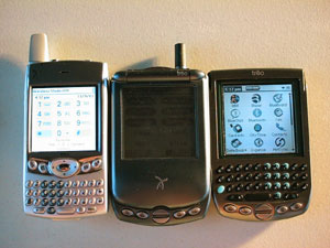 It is as bright (or brighter) as the Visor Prism, and the pixel density makes everything more readable. The color is 11.5 bit, or 2896 different colors. I did not notice any issues with the screen being 11.5 bit, and not 12 or 16 bit. Outside, the screen was readable It worked better than the screens of the Treo 270 or 300 outside, but it was still slightly washed out. Handspring chose a great display to use, but for $600, the Treo 600 deserves better.
Inside the Treo 600 is 32 MB of memory (24 MB accessible to the user), and a 144 MHz processor. 144 MHz is on the lower end of the available ARM processors (the PalmOne Tungsten C has a 400 MHz processor) however; the Treo 600 feels zippy fast. Using the slower processor, Handspring is able to achieve better battery life. The GSM Radio inside is quad-band, meaning that it runs on the 850, 900, 1800, and 1900 MHz GSM networks around the world. The Sprint Treo 600 has a CDMA radio inside that works on the 800 and 1900 MHz Digital networks nationwide. It has a built in vibrator that I found to be fairly weak, and IR ports.
Next Page: Input >>