Home | Stories | Reviews | TreoCast | Treo Store | Accessories | Software | Discussion at webOS Nation | Mobile | About | Search
 
treocentral.com >> Products & Reviews >> Software
BugMe! Messenger

Fri Mar 2, 2001 - 12:51 PM EST - By Alan Graham

Thumbnail View

When you launch BugMe! Messenger you get a nice thumbnail screen that shows you a small image of each note. To the right of the thumbnail there are icons that represent different features. They include:
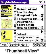
•Title of note

•If and what time the reminder alarm is set to go off.

•An e-mail icon that shows you if and to whom this note has been sent.

•A icon that lets you view any notation you may have added to describe the note.

•A trash can icon to delete each note.

Tapping on the thumbnail of any image opens it to full-screen.

At the bottom of this screen you will find icons that allow you to create a new note, check for new notes or send all notes. It is a very clean and easy interface. My only problem is that you can only sort the order of the thumbnails by their Alarm time. I'd really like like to see some other variations.


Next Page: Input - Less like Rembrandt, more like Pollock >>


Treo accessory store
 
User Opinions
Thumbs Up 55% Thumbs Down 45%

Read Opinions (20)


Would you recommend BugMe! Messenger?
Yes   No  

Product Info
Details
> Name BugMe! Messenger
> Company Electric Pocket
> Size 216k
> Fact Sheet & User Opinions
Availability
> Available
Pricing
> $39.95

References
Actions
> Print this page
> Digg!


Copyright 1999-2016 TreoCentral. All rights reserved : Terms of Use : Privacy Policy

TREO and TreoCentral are trademarks or registered trademarks of palm, Inc. in the United States and other countries;
the TreoCentral mark and domain name are used under license from palm, Inc.
The views expressed on this website are solely those of the proprietor, or
contributors to the site, and do not necessarily reflect the views of palm, Inc.
Read Merciful by Casey Adolfsson