Aesthetics
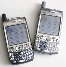
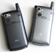 Michael: The Treo 700p is remarkably similar in shape, size, and weight to the Treo 650. At 4.4x2.3x0.9 inches, it is identical in height, width, and depth to existing Treos and barely heavier (6.4oz instead of 6.3oz). From the outside, it's changed only aesthetically. The toyish blue-purple case on my Sprint Treo 650 is replaced with a professional dark steel blue color. The screen is framed by flashy silver paint, but it is less noticeable than on the Treo 650.
Harv: The 700p uses exactly the same casework, has the same dimensions, connectors, ports, card slot, antenna, buttons, well just take Windows out of a 700w and put PalmOS in and you have a 700p. The 700 series' glass screen is about 2mm bigger, diagonally, than the 650's, but the P's resolution is the same. The number of pixels is the same.
Michael: In general, the main aesthetic difference between the 650 and the 700p is squareness�and it's a big improvement. The rounded back and corners of the 650 turned angular on the Treo 700p. The circular egg-shaped center key and five-way navigator are more square.. The back speaker grill is a rectangle instead of an oval. The camera's lens and tiny primping mirror look a little different but they're in the same place. The earpiece hump is much less pronounced. I like these changes; they make the Treo 700p feel more professional and modern than the Treo 650.
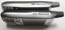 Harv: Well modern is as modern does. If the 650 had had the 700's casework and the new model looked like the 650, (reversal of reality).. would we say the 650 looks more modern? It's an evolutionary, not a revolutionary change. Like a car model whose body style gets "freshened" with some design tweaks and twiddles to the grille and tail lights from one year to the next. Palm probably could have put the 700p's guts into the 650 casework. They chose not to and went with the 700w's design instead. Luckily, the two are not all THAT different; your 650's cradles should fit the 700p just fine. Most 650 cases should fit the 700p, although with that modified central bank of control buttons, some are gonna fit better than others, depending on their design.
I prefer the curvy volume rocker on the 650 to the two flat side keys on the 700p. It's easier to feel and use with a thumb than a pair of flat buttons.
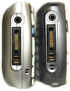
At least Palm didn't change the bottom connector again and that the Athena "multi-connector" is now the standard across their whole current lineup of products.
Under the hood.
 Michael] Inside, the most notable difference is the Treo 700p's new 3G CDMA radio. Using a dual band digital radio (800/1900Mhz), it can handle both 1xRTT data (like the 650) and, in most major metropolitan areas, EVDO data.
EVDO, or "Evolution Data Optimized" branded by Verizon as "BroadbandAccess" and by Sprint as "PowerVision", has max speeds of 2.0 Mbps. In normal use, speeds range from 300-700 kbps; roughly ten times faster than a 56k dial-up modem, and ten times slower than a typical cable modem; just a little slower than a DSL connection. These numbers are ballpark, variable throughout the day, depend on where you are, how close to a cell tower you are, how many people are sharing that tower's signal, in other words, if you run the mobile speed test at DSL Reports on a 700p ten times in a row, you'll probably get ten slightly different results.
 Harv: If there is any technology in the Treo 700p that changes the whole Treo experience, it is EVDO connectivity. It is probably the single most compelling reason to upgrade from a 650. EVDO data speed is to 1xRTT like yanking the four banger out of your Toyota and stuffing in a V-8 is. Smoke the tires instead of shifting down a gear just to try to get up that hill. Like the commercials say "It costs a little more, but it does so much more."
Michael: The Treo 700p uses an Intel PXA272 312 MHz processor, which is a slightly newer, smaller version of the Treo 650's PXA270 312 MHz CPU.. The new Treo ships with 128 MB of memory, but only 60 MB are available for user storage. 60 meg is more than double the memory available on the 650, and is a much-needed improvement. Out of the box, the Treo 700p feels fast and responsive, but many users have found that as you use more memory, the Treo slows down.
Harv: But I have to wonder why Palm didn't just go whole-hog and give us a lot more memory in this new baby. Well sure, more RAM takes more power, longer bootup (and Palm's whole gestalt has been based on its "instant on" factor), and ten years ago, a handheld with 60 meg of internal user storage would have been a pipe dream, but still..
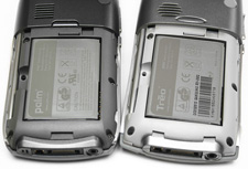
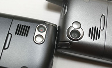 Michael: The camera is a clone of the 700w's: a healthy 1.3 mega pixels. The mic is on the bottom (VERY slightly moved a squinch), an SD card slot is up top, and a mono speaker on the back. The familiar ringer switch still graces the top with that nice added feature of vibrating when the sound is turned off. The 1800 mAH battery is identical to the battery in the Treo 650, and like the 650 you take off the back door to get to it and the reset hole. Higher capacity batteries are available from third parties.
 The Screen
The 320x320 TFT 16bit color LCD screen on the Treo 700p is, as mentioned, very slightly bigger than the 650's, and still bright, razor sharp, and easy to read, like the screen on its predecessor. To my eyes, the 700p's screen has a slightly whiter backlight and is a little brighter than the 650's. Text is crisp, photos are bright and detailed, and you can see a lot of text, spreadsheet, or webpage on one screen.
Harv: After spending a few months with a 700w's 240x240 screen, I can honestly say that both the 650 and 700p's higher resolution kicks the crap out of their Windows-based brother. And Michael is right on � the 700p's screen is definitely whiter and brighter than the 650's, with both set to the same place on the brightness slider.
The Keyboard
Michael: The 700p's keyboard is more slightly curved into a crescent shape than the keyboard on the Treo 650, but like other features, is otherwise very similar to the 650's. The shape of the keys changed from "egg" to square-ish, while the keys' backlight is much whiter. These changes, however, don't affect usability to any great degree.
 As on the 650, the number 5 key has a small raised nub. The activation energy of the keys seems greater than the Treo 650, and so typing is just slightly harder; this may simply be an artifact of comparing my worn-in Treo to a new one. It takes time to get used to typing on any thumb board, and everyone has their favorite style, shape, and spacing; but it's my opinion that the Treo line has a competitive keyboard, useable for emailing, word processing, or web surfing.
Harv: Maybe because my current 650 is a "new" refurb I can't really tell much difference in key pressure between the two models. The changed key shapes and keyboard curve are pretty subtle, yet horribly obvious if you're a long-time 650 owner and you hold the two phones side-by-side.
Action keys/Five-way pad
Michael: The Treo 700p has the same positioning of action buttons as the Treo 650: a rocker and action button on the left hand side, 4 main keys, a five-way, and two keys above the 4 main keys. But the function of these keys has dramatically changed.
In order from left to right, the four hard keys are now Phone, Calendar, Mail, and Home. The menu key has moved back to the bottom right of the keyboard. Current Treo 650 owners who upgrade will find this change confusing, while all users will find it hard to reach when needed. Like the 700w, the 700p has two action buttons at top. Palm OS has no support for soft keys, so these keys have are dedicated phone send and end/power buttons. I don't see why Palm felt the need to change the key layout from the Treo 650, as the new dedicated phone send and end buttons are nearly useless. A software application named LudusP is already out and lets you redefine these buttons.
Keyguard on the Treo 700p is identical in function to that of earlier Treos � press center to unlock. But a truly useful new feature that Palm added to Keyguard is the display of the current time in the Keyguard window.
Harv: Allow me to rant here for a sec, but remember these are just my opinions (but you're welcome to buy them).. After using a device, any device, for a long time, one's brain gets wired as to where its controls are. They become second nature. You don't even have to think about what button does what and you know what's where. After a week with my 700p, I'm still hitting the upper red off button to pull down a menu and the lower right button to shift into caps (D'oh!) because Palm moved the menu button down where the right shift key used to be! I thought it was fine the way it was. "If it ain't broke, don't fix it."
Why move these important buttons around like this? I miss having two shift keys. I don't like the menu button way down in the corner. This seems like nothing more than change for change's sake, not to improve functionality, or "Well, we're going to use the 700w's casework and buttons on the 700p so let's move things around." Imagine coming home one day and every doorknob in your house is on the "wrong" side. Or your refrigerator opens the other way. Or some evil elf moved the buttons around on your cable box's remote that you use without even looking down at it. Ever go on a trip and have to get used to a rental car, then you come home and your own car seems weird for a few days? �Nuff said.
The enigma of LED behavior
Michael: The behavior of the front LED has changed for the better on the Treo 700p. Now, the LED shows charging status, and alerts. No longer will your Treo blink green when simply on the network; that feature kicks in only when you have pending alerts. Palm simultaneously pleased many users and added a useful alert feature in changing this LED behavior.
Harv: I have to disagree. The dark LED (on Sprint 700ps � apparently on Verizon's, it still blinks to show a network connection like the 650 does) drove me nuts. I thought my brand new 700p was broken. I dug through the manual. It mentions blinking to call your attention to an alert, but it does NOT mention that the green blinking "Hey I'm on the network" went away on Sprint units. I called my contacts at Palm's PR firm. "Does yours blink?" "No." I combed TreoCentral's forums and found a fifty message thread with new 700p owners asking the same question.
I called Palm tech support and a woman (in India, of course) told me "Yes, it's broken; it's supposed to blink. Would you like an RMA to return it?" Sigh. The LED behaved normally otherwise. Solid red when charging. Solid green when charged. An LED can't be "sort of broken" any more than a woman can be "sort of pregnant."
Finally, a Palm engineer posted to that Forum thread that this is now normal behavior on a Sprint 700p. Riddle solved. But I have to wonder why they didn't make this a toggle in the firmware. Like the blinking LED? Leave it on. Don't like it? Turn it off. If there isn't already a program out there to add this toggle, I'm sure someone is working on one. Why this change on Sprint and not on Verizon? "Sprint got a lot of complaints so they had it changed it to behave this way." And Verizon didn't get the same complaints?" Hello?
The Phone >>
Copyright 1999-2016 TreoCentral. All rights reserved :
Terms of Use : Privacy Policy
TREO and TreoCentral are trademarks or registered trademarks of palm, Inc. in the United States and other countries;
the TreoCentral mark and domain name are used under license from palm, Inc.
The views expressed on this website are solely those of the proprietor, or
contributors to the site, and do not necessarily reflect the views of palm, Inc.
Read Merciful by Casey Adolfsson
 Michael: The Treo 700p is remarkably similar in shape, size, and weight to the Treo 650. At 4.4x2.3x0.9 inches, it is identical in height, width, and depth to existing Treos and barely heavier (6.4oz instead of 6.3oz). From the outside, it's changed only aesthetically. The toyish blue-purple case on my Sprint Treo 650 is replaced with a professional dark steel blue color. The screen is framed by flashy silver paint, but it is less noticeable than on the Treo 650.
 Harv: Well modern is as modern does. If the 650 had had the 700's casework and the new model looked like the 650, (reversal of reality).. would we say the 650 looks more modern? It's an evolutionary, not a revolutionary change. Like a car model whose body style gets "freshened" with some design tweaks and twiddles to the grille and tail lights from one year to the next. Palm probably could have put the 700p's guts into the 650 casework. They chose not to and went with the 700w's design instead. Luckily, the two are not all THAT different; your 650's cradles should fit the 700p just fine. Most 650 cases should fit the 700p, although with that modified central bank of control buttons, some are gonna fit better than others, depending on their design.
 Michael] Inside, the most notable difference is the Treo 700p's new 3G CDMA radio. Using a dual band digital radio (800/1900Mhz), it can handle both 1xRTT data (like the 650) and, in most major metropolitan areas, EVDO data.
 Harv: If there is any technology in the Treo 700p that changes the whole Treo experience, it is EVDO connectivity. It is probably the single most compelling reason to upgrade from a 650. EVDO data speed is to 1xRTT like yanking the four banger out of your Toyota and stuffing in a V-8 is. Smoke the tires instead of shifting down a gear just to try to get up that hill. Like the commercials say "It costs a little more, but it does so much more."
 Michael: The camera is a clone of the 700w's: a healthy 1.3 mega pixels. The mic is on the bottom (VERY slightly moved a squinch), an SD card slot is up top, and a mono speaker on the back. The familiar ringer switch still graces the top with that nice added feature of vibrating when the sound is turned off. The 1800 mAH battery is identical to the battery in the Treo 650, and like the 650 you take off the back door to get to it and the reset hole. Higher capacity batteries are available from third parties.
 The Screen
 As on the 650, the number 5 key has a small raised nub. The activation energy of the keys seems greater than the Treo 650, and so typing is just slightly harder; this may simply be an artifact of comparing my worn-in Treo to a new one. It takes time to get used to typing on any thumb board, and everyone has their favorite style, shape, and spacing; but it's my opinion that the Treo line has a competitive keyboard, useable for emailing, word processing, or web surfing.